Planet Kind Printing
London has declared a climate emergency and global environmental issues are finally gaining the media momentum they need to turn heads towards change. We all have a responsibility to shrink our Yeti footprints back into those tiny Clarks we wore in primary school. For us at Big Gun, that means encouraging stand-out digital design and offering some (hopefully handy) tips on low impact printing!
The facts:
- According to the Global Forest Research Assessment, somewhere between 80,000 to 160,000 trees are cut down a day across the world – with some 30% of these being used to produce paper. This deforestation destroys ecosystems, releases greenhouse gases and affects rainfall and climate.
- The world consumes 300 million tons of paper every year. I know right...
- According to The Guardian, recycling roughly one tonne of paper reduces greenhouse gas emissions by one tonne of carbon equivalent, and saves around 7,000 gallons of water.
How can we make a difference?
- Perhaps the most obvious and effective way is to reduce our paper consumption and go digital wherever possible, although we know it’s not always as easy as that.
- Only buying what you need and recycling what you do buy would undoubtedly put a warm smile on Mother Earth’s face. She’d gently remind us not to forget the three R’s: Reduce, Re-use, Recycle.
- Planet Kind Printing - using alternative paper, ink and finishes that are less harmful to the environment.
Planet kind printing
When we’re not busy scything down trees, humans can also be pretty awesome. Here are some cool things our boffins have come up with:
- 100% recycled paper, or fibre based materials.
- Unbleached and chlorine-free paper.
- Biodegradable water-based protective coatings (these can be made from cellulose, corn starch or even sugar cane!) instead of polymer-based coatings and plastic laminates.
- Vegetable oil based inks instead of mineral oil-based ones which emit Volatile Organic Compounds (VOCs – or ‘nasties’) into the atmosphere.
Be sure to ask your printers if they use or offer these alternatives!
If they don’t, check out our friends ALP at www.alocalprinter.co.uk - they are eco-friendly print specialists.
Top tip:
When searching for recycled paper, keep in mind that most varieties are not made with 100% recycled materials, but manufacturers are required to list the percentage. For the bit that isn’t recycled, make sure it’s FSC certified – the Forest Stewardship Council work to promote the practice of sustainable forestry worldwide (they can stay).
Paper alternatives
Here are some of our favourites; all 100% recycled!
1) Tree Free Cotton Paper - also known as rag paper, this is made using cotton linters or used cloth as the primary material. It’s extremely durable and takes years to deteriorate.
2) Bond Paper - normally a mix of cotton and pulp. This paper feels beautiful and is becoming very popular in line with vintage trends and retro sentiments.
3) Kraft Paper - for those businesses who want to make ‘eco’ part of their brand. This stand out brown paper does the work for you - even the most understated designs pop on these bad boys. Great for wedding stationary too!
4) Pulp Paper - (think Beer Mat). Pulp is a fibrous material which is made by separating fibres from wood, fibre crops or waste paper. Generally, this is made up from mostly sawmill residue, along with wood chip and recycled waste paper. Flipping marvellous.
5) Online publications - (okay, so it’s not a paper, but. . .) With many of the online platforms, you can publish magazines, books, brochures and more. You can share ad free flip booklets, track interactions and embed links. At Big Gun, we offer online publication as standard with long format designs.
(We’re not just saying this, but. . .) Using these papers really can enhance your designs and feed into a growing, planet saving trend - as well as demonstrating to your clients that you run a forward thinking, eco-kind company . . . Consumers are actively looking for products and suppliers that demonstrate care towards the environment, so what’s not to love?
Planet kind printing in action
Read about our work with My Child's Planet - who carefully curate eco-conscious hospital boxes for new mums.
Their low impact marketing and packaging include recycled cardboard boxes, printed with vegetable based ink and seeded paper!

Seeded Leaflet
Pulp paper infused with wildflower seeds.
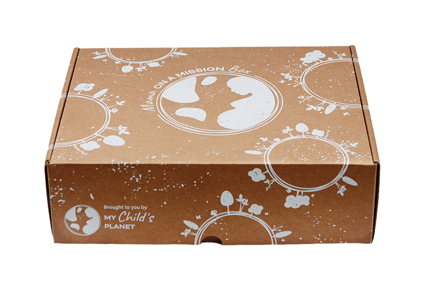
Recycled Cardboard Packaging
Printed sparingly with vegetable based ink.