The Psychology of Colour
From the moment we open our eyes, snooze a couple more times, skip yoga and sigh with relief into our first cup of coffee, we are responding to colour.
Colour psychology has become a hot topic in marketing and design over recent years. And rightly so - when executed correctly, choice of colour can be the most effective weapon in a designer’s arsenal. Colour is the first thing you notice and the last thing you remember. Long before a potential customer has read your strapline or noticed the hidden arrow in your logo (hands up Fedex), they’ve had an emotional reaction to the colours in your branding: they are already tuned in – or out.
What's happening in our brain?
A question I often agonise over in a broader sense, but; simply put - colours trigger associations which contribute to our perceptions. These are a combination of social learning and biological predisposition. These triggers can have a direct effect on our physiology too: in extreme cases, colours can influence heart rate, anxiety and even blood flow.
Let's go back a bit
Theorising on colour and psychological functioning has been a thing since Johann Wolfgang von Goethe penned the rather unimaginatively titled Theory of Colours in 1810. Johann speculated on the link between colour categories and human emotional response. Since then, many other humans, with and without cool names, have researched the topic with varied outcomes.
One theory that we like here at Big Gun is the Colour in Context Theory (Elliot & Maeier 2012), which draws on social learning as well as biology. These two reckon some responses to colour are solely due to repeated pairing of colour and particular messages or experiences (social learning), whereas other responses represent a biologically engrained predisposition that is reinforced by social learning. In consumer terms, this could be explained like this:
When I walk past Holland & Barrett’s green shop front I think of health because there are loads of health brands that use green - (social learning)
When I walk past Holland & Barrett’s green shop front I think of health because green is the colour I most associate with nature - (biological predisposition)
Now, a bit further back:
Let’s consider nature and take red as an example. . .It’s a colour that comes up a lot in the natural world and is used to great effect in marketing (and in other areas, such as sport, where it statistically correlates with winning teams). In many animals, such as primates, dominance in aggressive encounters is signalled by the red hue of oxygenated blood visible on bare skin. This can also be true for humans in similar encounters: a testosterone surge leads to a red face, whereas fear leads to pallor. Is this perhaps why red is a colour which invokes such strong feelings of dominance, danger and attraction?
So how does all of this work in marketing terms?
According to Kissmetrics, 93% of consumers considered visual appearance as the most important consideration in making a purchase. Colour addresses one of our most basic neurological needs for stimulation, and there are two ways in which this is harnessed in marketing: response and recall.
Response
Colour is chosen to invoke an emotive response, a feeling which we then associate with the brand or product. To illustrate this, consider the Wimbledon Tennis branding. How does the colouring make us feel? From a social learning perspective, we imbue purple with feelings of wealth and luxury – it’s the royal colour. From a biological perspective, green can bring to mind natural richness and the shading used here is mature, dignified. The combination is refined and tasteful, perfectly representing the event.
Recall
Colour is the secret weapon of recall – boosted by font, of course. It can increase brand recognition by up to 80%. Brands like Coca Cola and Cadburys are extreme examples - that red or purple is all we really need to get those synapses going! This acquired recall power is brazenly piggybacked across countless products and brands - budget supermarkets, for example, are prime culprits. Consider Aldi’s Jive bar, which is a somewhat shameless imitation of a Twix. The colour scheme along with the font and product size triggers the same liking and familiarity that Mars spent years developing with the Twix.
So what are the rules here - what means what?
Ah. The crux of the matter. As a topic still in relatively early stages of research, and with a myriad of nuances at play, there simply are no hard and fast rules. Our reaction to a colour will vary dependant on our age, gender, conditioning, and other factors including current trends, context and combinations.
Then there are international considerations. A colour scheme used to market a brand to great effect in sunny old England might have completely different connotations in, say, China. Beyoncé very kindly provides a working example of this with her Ivy Park clothing brand: the burgundy and orange tracksuit, that I’m sure looks super cool when rocked on the streets of central Houston, could have you mistakenly asked where to find the butter beans in Horsham Sainsbury’s.
Surely there must be some things we agree on?
Sadly there are very few.
Blue is widely used with international brands - the colours connotations vary slightly but they are almost universally positive.
Yellow, on the the other hand, is quite the double dealer! Us Brits generally associate yellow with warmth and hospitality. In Japan it is a royal colour, representing courage and prosperity whereas in Egypt and Latin America it is a colour of mourning.
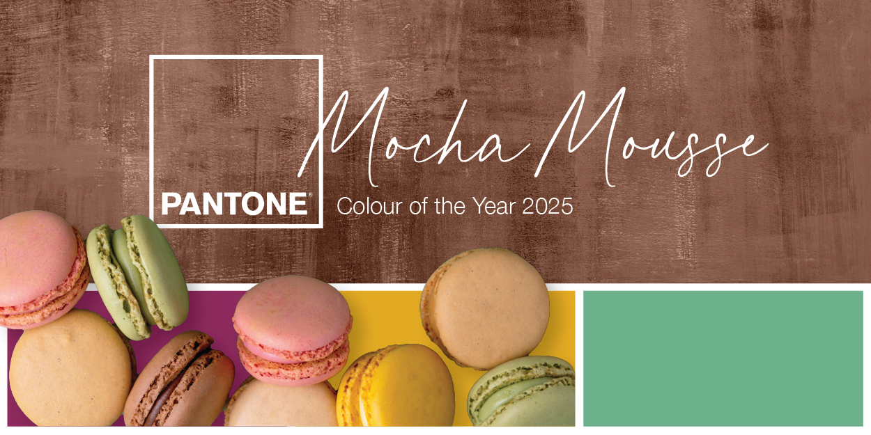
In terms of current trends - keep an eye on Pantone. They release a colour of the year every December, intended to predict global trends and influence many industries including fashion, interior design, product packaging and graphic design.
Wrap it up
So, the role of colour in psychological functioning is a topic still in its nascence, but already one with a kaleidoscopic range of use in the design world. With all that said - the beauty of art and design is subjectivity - everyone is different and will respond in different ways. There is certainly no black and white.